You are a cartographer – what have you made of the coverage of Donald Trump’s bid to claim Greenland for the United States, particularly the use of maps?
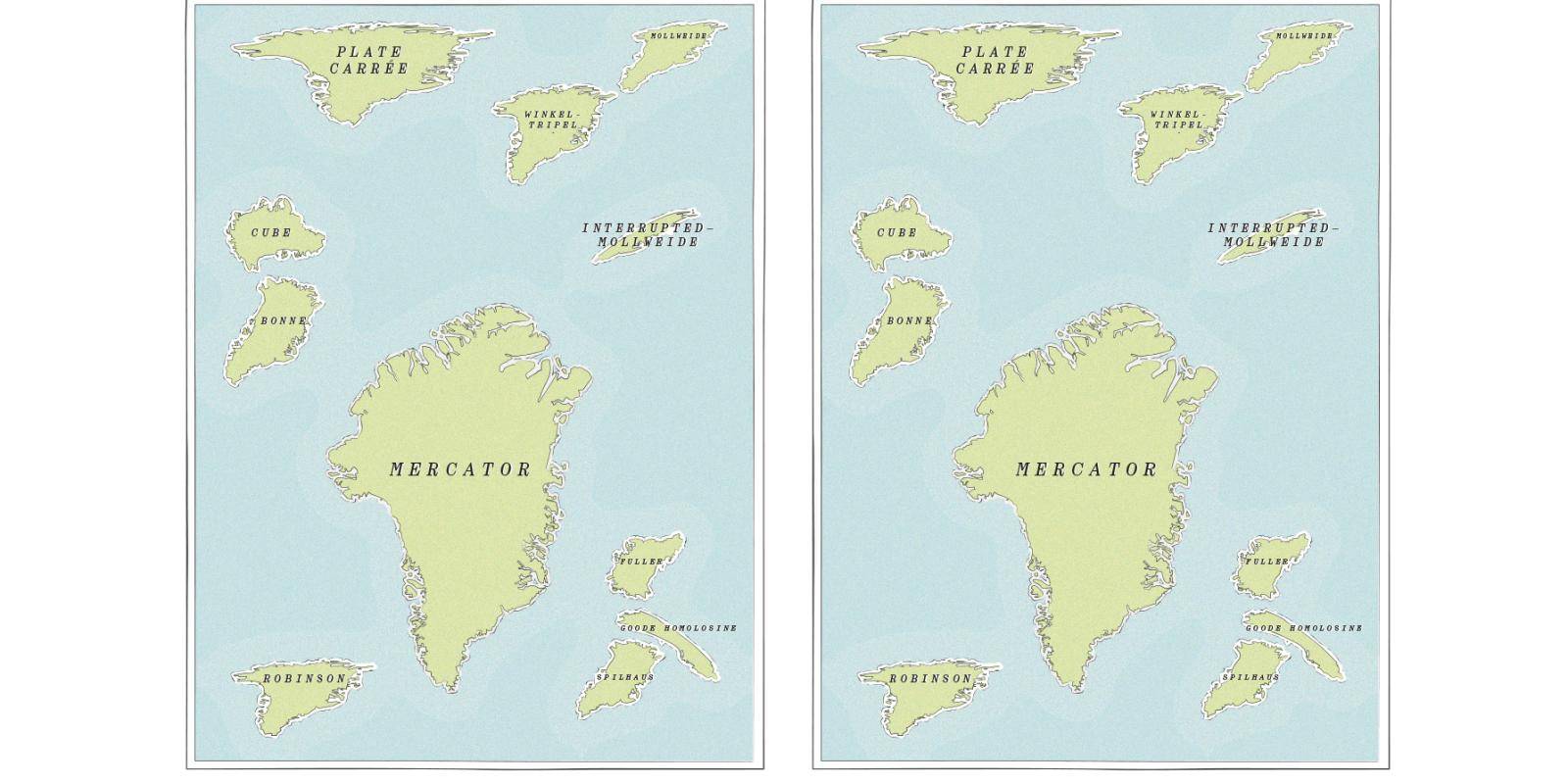
There has been lots of chatter online about how the Mercator map projection makes Greenland look huge. No geographer in a hundred years has thought the Mercator projection is a good choice for a world map, and it barely even appears in atlases today. But I haven’t seen any evidence that Trump is being bamboozled by the Mercator projection, or that he cares only about the apparent size of Greenland.
There are far more interesting things we can do with maps to show how Greenland connects Europe and North America. Flight paths between North America and Europe often pass over Greenland. Its proximity to Russia makes it an excellent location for military bases. And I have been surprised not to see more maps showing the sites of its critical minerals – where are those? Ethnographic maps could also be helpful.
The population of Greenland is concentrated in the west and southwest, with only scattered towns and villages in the east. The ties to Denmark are deep, but the population also has strong cultural and linguistic ties with the Indigenous peoples of North America. Even geologically, Greenland is more connected to North America than Europe. That’s not to say I’m pro-annexation, but there’s far more we could do with cartography to show Greenland as a complex hinge between Europe and the United States.
There are many map projections, but in your book ‘Radical Cartography’ you say they tend to carve up the world in three ways – into the Americas, Eurasia and the Western Pacific. To what extent do standard world maps underlie Trump’s emerging vision of geopolitics divided into spheres of influence?
I think there’s a strong case to be made for that. The Monroe Doctrine, itself from two centuries ago, is based on hemispheric thinking – the old world is one hemisphere, the new world is another, separated by great oceans, with the US claiming this hemisphere as its backyard. That is a powerful mental diagram, reinforced by standard world maps, which make the Americas appear removed from Africa and Eurasia and therefore something the US might plausibly dominate.
Greenland is interesting in this context because there are plenty of places in North America that are closer – strategically in terms of air routes – to what’s happening in Europe and Asia than anything in the southern cone of South America. The US has more legitimate national security interests in the Arctic than it does in South America. Chile and Argentina are not, in fact, in America’s backyard at all. That kind of hemispheric thinking is more ripe for scrutiny than any single map projection.
Certain geopolitical mapping seems intentionally vague. China’s contentious claim to the South China Sea – the ‘Ten-Dash Line’ – is said to be deliberately ambiguous. Is that a problem?
The South China Sea is a good example, but we see others – disputed areas that are effectively frozen or that flare up periodically. The naive reading of a map would be to say that both parties would be better off resolving disputed areas. But in many cases that’s not true. Both parties to a bilateral disagreement may actually feel they are better off not trying to resolve it, because attempting resolution would cause greater problems.
There’s a real question about how you show that on a map. How do you make clear that this is not a temporary misunderstanding, that the perfect map is not necessarily the one where all disputes are resolved? In many parts of the world there are competing claims based on maps that are centuries old, well beyond anything that could have been practically claimed at the time. These are negotiating positions, frozen conflicts, strategic ambiguities – and the language of mainstream cartography doesn’t handle those well.
I remember doing a project for a certain publisher about competing claims to the Arctic, including from Russia, Canada and the US. I found a way to show all these overlapping claims using various shades and gradients, not trying to fix a single line. But it came back from the editors with crisp lines inserted. I said no – you can’t put those lines there. And alas, I was overruled.
Sovereignty in the oceans, especially since the UN Convention on the Law of the Sea came into force in 1994, is not a black-and-white issue. There is a feathered edge of sovereignty, where different rights are claimed at different distances from shore. You’re not necessarily claiming control over shipping lanes – instead it’s often only over subsea resources, claims that require intensive mapping and are often contested. The idea that we must have a crisp line dividing one country from another is often inaccurate when it comes to what states are actually claiming.
You write that maps don’t just show us data – they help construct our world. Data is messy and flawed, and therefore cartography should reflect that. Can you explain this?
Oceanic sovereignty is a perfect example, because sovereignty means different things at different distances from shore. A binary sharp line is inaccurate – it doesn’t show the world the way we know it to be. We need different graphic conventions, even just to represent the political reality we can already describe. Beyond that, there are cases – the Chinese Ten-Dash Line being one – where we can’t draw a clean map in the first place, because there is no single situation to map.
So there are at least two challenges running simultaneously: mainstream cartographic conventions are often inadequate to show a complexity we do understand; and there are situations where we cannot say with confidence where we would put the lines even if we tried. The map itself should be messier. It should raise questions of ambiguity and multiple claims, rather than presenting a simplified version and then walking it back in a footnote.
You say that maps of clean lines and jigsaw-puzzle shapes have often enabled sharp political divides, not the other way around. Have you an example?
We do not live in a jigsaw-puzzle world, even in the straightforward sense of what sovereignty currently means. In the US context, consider American Indian reservations: tribal sovereignty is taken seriously by both Indigenous peoples and the federal government, yet the Supreme Court has long held that Congress retains ultimate authority over those sovereign nations. State boundaries sometimes run straight through reservations. These are places not subject to state jurisdiction, yet they sit inside states. Showing the contradictions of actual sovereignty as it exists is important.
There’s another level too. Even within territories where a state makes a uniform claim to sovereignty – within the US or anywhere else – the territory is not homogeneous. There are vast differences in population, resources, climate and the practical reach of state power. Cartography ought to be helping us think about those realities, rather than simply presenting the international system as an abstract arrangement of autonomous jigsaw pieces.
We have maps on our phones and there has been a digital boom in cheap and free mapping. Are we more cartograph-ically literate as a result?
I don’t take the view that things were better in the past, or that ubiquitous tools have turned everything to slop. Maps in the past had less data and less time for processing – they could be fairly mediocre. What the accessibility of mapping tools now means is that more people can be experimental and creative. When only large institutions – governments, National Geographic and the like – could produce maps, there was little room for outsiders to imagine the world differently. Now there is room.
Someone who has thought deeply about rare earths, say, and has a relevant database, can make a map that reflects genuine subject expertise, tailored to a specific question, rather than having to fit their work into a product designed to appeal to everybody. That’s the promising vision.
The downside is that it’s not happening as much as I’d like. People tend to default to how the software thinks, or how things have always been done. My biggest concern with Google Maps is that it applies the same graphics to everywhere in the world. New York City is drawn using the same visual language as Liberia. Those are very different places with very different issues, and there is no good reason to represent them identically. There’s a real risk in saying that we now have one map for everywhere in the world, and that’s sufficient. The opportunity we have is to make different kinds of maps, produced by different kinds of people. We ought to be pursuing that, rather than searching for the one map suitable for everything.
At the front of our magazine we use a version of the Dymaxion projection by Buckminster Fuller – what are your thoughts on that?
What kind of world is that projection conjuring? It implies that the Northern Hemisphere is a kind of central node, with Africa, South America and Australia as offshoots – South America connected to North America, Africa to Europe, Australia to Asia. It doesn’t emphasize connections between, say, South America and Africa, or Africa and Australasia.
For many purposes that’s defensible, but if you were trying to understand South–South economic relations, you would find the projection actively unhelpful. If it were the only map you ever looked at, you’d be genuinely surprised by the shipping lanes between, say, South Africa and Brazil.